Highcharts教程(20) 曲线图例子二

发布时间:2020-07-03编辑:脚本学堂
本文是Highcharts教程的第二十节,介绍下Highcharts中曲线图的另一个实例,有需要的朋友参考下。

本节内容:highcharts教程第二十节的内容,曲线图的例子。

例子:
 

复制代码 代码示例:
<!DOCTYPE HTML PUBLIC "-//W3C//DTD HTML 4.0 Transitional//EN"> 
<html> 
<head> 
    <meta http-equiv="Content-Type" content="text/html; charset=utf-8" /> 
    <title>高血压发生率曲线图-www.jb200.com</title> 
    <style type="text/css"> 
        .hh 
        { 
            font-weight:lighter; 
        } 
    </style> 
    <script type="text/javascript" src="Lib/Scripts/jquery-1.7.2.min.js"></script> 
    <script src="Lib/Highcharts-2.2.5/js/highcharts.js" type="text/javascript"></script> 
    <script type="text/javascript"> 
        $(function () { 
            var chart; 
            $(document).ready(function () { 
                chart = new Highcharts.Chart({ 
                    chart: { 
                        renderTo: 'container', 
                        type: 'spline', 
                        plotBorderWidth: 0, 
                        marginRight: 110, 
                        style: 
                        { 
                            fontFamily: 'Microsoft YaHei', 
                            fontSize: '12px', 
                            color: '#262626' 
                        } 
                    }, 
                    colors: [ 
                           '#0476c5', 
                           '#fe7d7e' 
                            ], 
                    title: { 
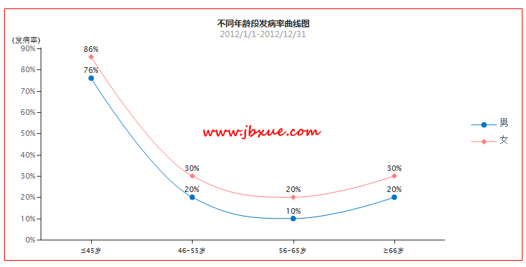
                        text: '不同年龄段发病率曲线图', 
                        style: { 
                            fontWeight: 'bold', 
                            fontFamily: 'Microsoft YaHei', 
                            fontSize: '12px', 
                            color: '#262626' 
                        } 
                    }, 
                    subtitle: { 
                        text: '2012/1/1-2012/12/31', 
                        style: { 
                            color: '#9e9494', 
                            fontFamily: 'Microsoft YaHei', 
                            fontSize: '12px' 
                        } 
                    }, 
                    xAxis: { 
                        lineWidth: 1, 
                        tickLength: 5, 
                        tickColor: '#272727', 
                        tickmarkPlacement: 'on', 
                        lineColor: '#272727', 
                        labels: 
                        { 
                            style: { 
                                color: '#262626', 
                                fontSize: '10px', 
                                marginTop: 5 
                            } 
 
                        }, 
                        categories: ['≤45岁', '46-55岁', '56-65岁', '≥66岁'], 
                        title: { 
                            text: '', 
                            align: 'middle', 
                            rotation: 0, 
                            offset: 0, 
                            style: { 
                                color: '#262626', 
                                fontSize: '12px', 
                                fontWeight: 'normal', 
                                display:'none' 
 
                            } 
                        } 
                    }, 
                    yAxis: { 
                        allowDecimals: false, 
                        min: 0, 
                        //max:100, 
                        endOnTick: false, 
                        gridLineWidth: 0, 
                        lineWidth: 1, 
                        lineColor: '#272727', 
                        tickWidth: 1, 
                        tickColor: '#272727', 
                        tickPixelInterval: 30, 
                        title: { 
                            text: '(发病率)', 
                            align: 'high', 
                            rotation: 0, 
                            offset: 0, 
                            y: -7, 
                            style: { 
                                color: '#262626', 
                                fontSize: '11px', 
                                fontWeight: 'normal' 
                            } 
                        }, 
                        labels: 
                        { 
                            formatter: function () { 
                                return this.value + '%'; 
                            } 
 
                        } 
                    }, 
                    legend: { 
                        enabled: true, 
                        layout: 'vertical', 
                        backgroundColor: null, 
                        align: 'right', 
                        borderWidth: 0, 
                        verticalAlign: 'middle', 
                        floating: true, 
                        itemMarginBottom: 10, 
                        symbolWidth: 36, 
                        itemWidth: 60, 
                        x:-10, 
                        shadow: false, 
                        style: { 
                            color: '#262626', 
                            fontSize: '11px', 
                            fontWeight: 'normal' 
                        } 
                    }, 
                    tooltip: { 
                        formatter: function () { 
                            return '' + 
                        this.x + ': ' + this.y + ' %'; 
                        } 
                    }, 
                    plotOptions: { 
                        spline: { 
                            shadow: false 
 
                        }, 
                        
                        series: 
                        { lineWidth: 1, 
                            dataLabels: { 
                                color: '#262626', 
                                formatter: function () { 
                                    return this.y + '%'; 
                                } 
 
                            } 
                        } 
                    }, 
                    series: [{ 
                        name: '男', 
 
                        data: [76, 20, 10, 20], 
                        dataLabels: { 
                            enabled: true 
                        } 
 
                    }, { 
                        name: '女', 
 
                        data: [86, 30, 20, 30], 
                        dataLabels: { 
                            enabled: true 
                        } 
 
                    }] 
                }); 
            }); 
 
        }); 
    </script> 
</head> 
<body> 
    <div id="container" style="width: 740px; height: 360px; margin: 0 auto; border: 1px solid red"> 
    </div> 
</body> 
</html> 
 

效果图,如下:
Highcharts教程 曲线图