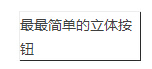
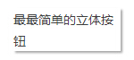
多个css立体按钮效果代码,用css实现立体按钮效果的例子,通过边框颜色深浅来表现立体按钮效果,通过box-shadow命令来表现立体按钮效果,附有多个演示效果图。
一、css立体按钮效果。
代码:
复制代码 代码示例:
<head>
<title>立体按钮效果</title>
<style type="text/css">
#elButton a {
color: #000000;
font-size:12px;
font-family:verdana;
font-weight:bold;
text-decoration: none;
border:4px outset aqua;
background-color:#00ffff;
display: block;
width: 130px;
padding: 3px 5px;
margin: 1px;
}
#elButton a:hover {
background-color: #00c0c0;
color:#000000;
padding-left:4px;
border:4px inset aqua;
}
#elButton a {
color: #000;
font-size:12px;
font-family:verdana;
font-weight:bold;
text-decoration: none;
border:4px outset aqua;
background-color:#00ffff;
display: block;
width: 130px;
padding: 3px 5px;
margin: 1px;
}
#elButton a:hover {
background: #00c0c0;
color:#000000;
padding-left:4px;
border:4px inset aqua;
}
</style>
</head>
<body>
<div id="elButton">
<div>
</div>
</div>
</body>
</html>
二、css实现立体按钮(边框颜色深浅)
1、通过边框颜色深浅来表现立体按钮效果
如下面的按钮,其实是左、上两条边使用了浅色,而右、下两条边使用了深色,让人感觉光源来自于左上角。让人觉得该按钮凸出的一种视觉效果。当鼠标移动到按钮上的时候,四条边的颜色刚好互换了下。造成一种凹陷的视觉效果,让人感觉按钮被按下去了。
css样式代码:
复制代码 代码示例:
.button{
border:1px solid;
border-color:#eee #333 #333 #eee;
cursor:pointer;
}
.button:hover{
border-color:#333 #eee #eee #333;
}
2、通过box-shadow命令来表现立体按钮效果
box-shadow是CSS3新增加的命令。
通过该命令,可以给任何文档对象添加阴影效果,既可以是外部阴影,也可以内部阴影(inset)。
主流浏览器的最新版本都已经很好的支持这个命令,包括IE9以及更新版本。
下面的按钮就是通过box-shadow命令达到的立体按钮效果。
css样式代码:
复制代码 代码示例:
.button{
box-shadow: 2px 2px 2px #aaa;
}
.button:hover{
box-shadow: 1px 1px 1px #aaa;
cursor:pointer;
}
很多css制作的立体按钮,大多是使用如上的两种方法。
三、css立体按钮实现代码
代码:
复制代码 代码示例:
<!DOCTYPE html PUBLIC "-//W3C//DTD XHTML 1.0 Transitional//EN" "http://www.w3.org/TR/xhtml1/DTD/xhtml1-transitional.dtd">
<html xmlns="http://www.w3.org/1999/xhtml">
<head>
<title>CSS3实现的立体按钮</title>
<!--[if IE]>
<script src="http://html5shiv.googlecode.com/svn/trunk/html5.js"></script>
<![endif]-->
<style type="text/css">
article,aside,figure,footer,header,hgroup,menu,nav,section{display:block;}
a{background-color:#DB5705;border-radius:8px 8px 8px 8px;box-shadow:0 9px 0 #DB1F05,0 9px 25px rgba(0,0,0,0.7);color:#FFFFFF;display:block;font-family:'微软雅黑';font-size:42px;font-weight:700;margin:100px auto;padding:4px;position:relative;text-align:center;text-decoration:none;transition:all 0.1s ease 0s;width:260px;}
a:active{box-shadow:0 3px 0 #DB1F05,0 3px 6px rgba(0,0,0,0.9);position:relative;top:6px;}
</style>
</head>
<body>
<p id="hello">Hello OSTools</p>
<a href="#">
脚本学堂 jb200.com</a>
<script type="text/
javascript">
if(document.getElementById('hello')){
document.getElementById('hello').innerHTML='Hello ostools - this was inserted using JavaScript';
}
</script>
<br>
</body>
</html>
如图:
